VML · UNITED RENTALS
2023
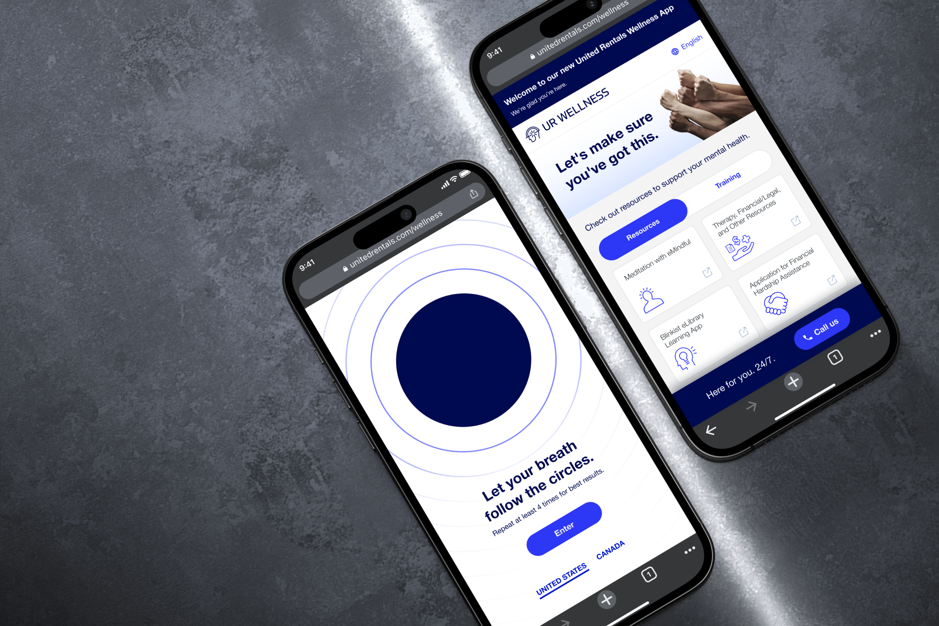
UR Wellness App
UX RESEARCH · UX · UI · ANIMATION
24/7 Mental Health Support
✳︎
26k Employees Given Access
✳︎
24/7 Mental Health Support
✳︎
26k Employees Given Access
✳︎
24/7 Mental Health Support ✳︎ 26k Employees Given Access ✳︎ 24/7 Mental Health Support ✳︎ 26k Employees Given Access ✳︎
Problem
United Rentals already offered mental health benefits to their 26,000+ employees. After losing a colleague to death by suicide in 2023, leadership wanted to make sure those resources were available 24/7,findable… and actually used.
The ask was a mental health portal. But once I started digging into the industry and who this was really for, it became clear that building the interface was the easy part.
Getting someone resistant to mental health support to open it… that was the real design challenge.
Solution
The portal needed needed to meet users where they are in their mental health journey. We had to be conscious of not using jargon that could dissuade the user from continuing their journey. And rather than greeting users with a resource list, we open with a breathing exercise. No explanation required. Just follow the circles for a moment of peace.
The goal was to ease users into the experience before they had a chance to opt out. By the time they hit "Enter," they'd already done something for their mental health.
Understanding the User & their resistance
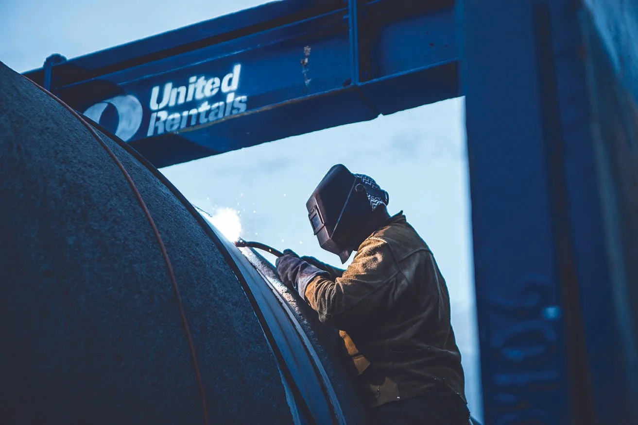
This was scoped as a UI project, but the sensitivity of the subject pushed me to look harder at who we were designing for. The male-dominated Construction industry was rated 2nd highest industry leading in death by suicide. I dove in to understand why.
The Insights
Construction has the second-highest suicide rate of any industry
CDC data showed 56 men and 10.4 women per 100,000 construction workers die by suicide each year — nearly twice the civilian working average. That statistic grounded every decision that followed.
Men are 5× more likely to act on suicidal ideation
This made men the clear primary audience, a research-backed decision, not an assumption. Knowing that helped shaped the tone, language, and entry point of the entire experience.
The barriers are cultural and not logistical
We faces several UX pain points including: stigma, "tough guy" socialization, therapy-speak aversion, and limited emotional vocabulary. These things are deeply ingrained. The design had to work around all of them without calling attention to any of them.
Reframe mental health as strength, not struggle
Research into male depression and help-seeking behavior made one thing clear: the framing is of high priority. Positioning mental health care as active self-management, instead of not vulnerability, changed the entire design approach.
The 4-7-8 breathing method
Developed by Dr. Andrew Weil, the 4-7-8 breathing technique is a simple, pranayama-based, natural nerve relaxer that induces calm by forcing the mind and body to focus on breath regulation. By inhaling for 4 seconds, holding for 7, and exhaling for 8, this method acts as a "natural tranquilizer," slowing heart rate and reducing anxiety.
A tool to return to
Leading the experience with the exercise — without naming it as therapy or meditation — lets users experience the benefit before they have the chance to resist it. It's a gentle, effective entry point into a space that can feel intimidating to much of our audience. It’s a tool for their mental health tool box for their journey.
Adopted before go-live
A few of the Product Owners on the account clapped when we first presented, resonating with the approach. They became the app’s champions, driving organic adoption by using the breathing exercise prototype to open team meetings, before the app officially launched.